
Medicare.gov · Lead Designer
A wayfinding pilot that created a centralized hub, making mental health coverage easier to find and understand without rewriting a single existing page.
20.2M
Users reached at email launch
51%
Increase in visits to outpatient care page
43%
Increase in visits to depression screening page
As Lead Designer, I owned the end-to-end UX process on a cross-functional team.
Problem
Medicare.gov receives over 4.3 million visitors per month, but people struggling to understand their mental health coverage had no clear starting point.
Coverage information was scattered across disconnected pages, and search results failed to surface a coherent picture of available care options — leaving users to piece together critical health decisions on their own. Page titles were broad and non-descriptive, giving users no context for how the different parts of Medicare related to mental health care.
How might we...
help beneficiaries with lower health literacy find and understand their mental health coverage, without rewriting existing content?
Individual pages explained healthcare coverage but were fragmented across the site
Goals
Give people seeking healthcare a clear starting point, and give the content team a structure they could maintain.
User goals
Business goals
Process
Discovery was clear on the problem. The constraint shaped how we solved it.
Research combined quantitative data from Adobe Analytics with a thorough qualitative effort: cross-team research reports, a comparative analysis of healthcare insurance sites, and UX, content, and technical audits.
Key insight
Navigation paths to mental health content were too fragmented to support user comprehension. No single entry point connected the relevant content, leaving users without a mental model of their coverage.
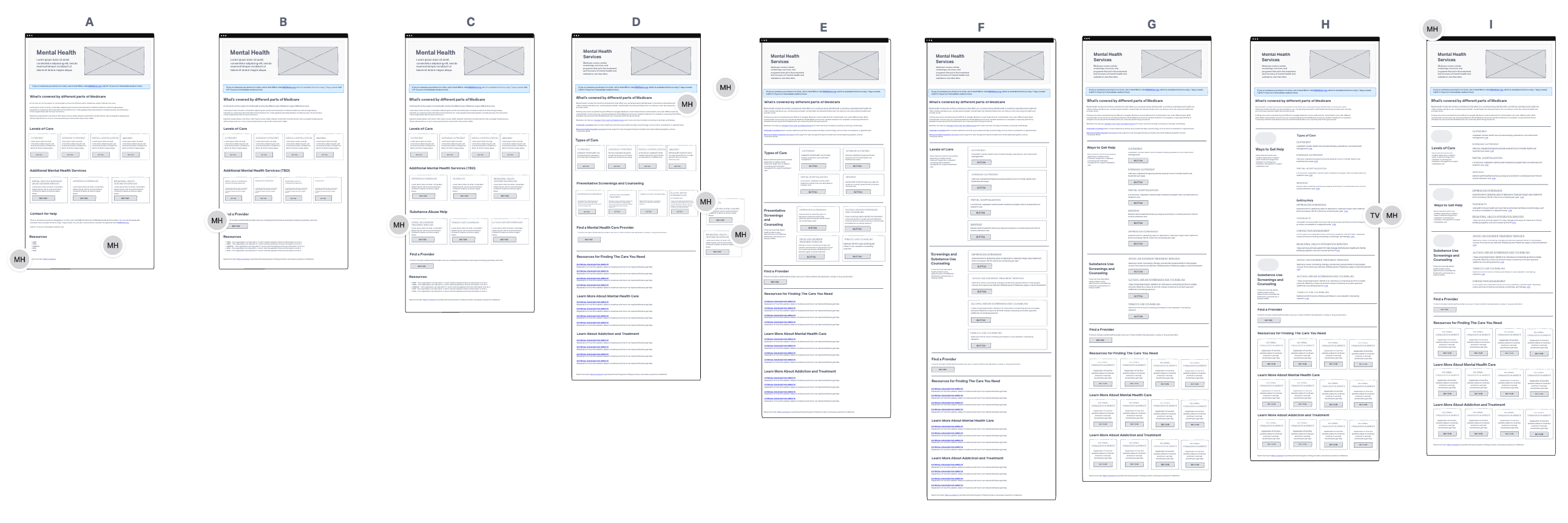
I worked with the content team to experiment with wireframes based on content groups
constraint
Two hard limits shaped the solution: the site runs on Drupal, and existing content had been legally cleared and could not be rewritten. The design had to work within those boundaries by organizing what existed, rather than replacing it.
Solution
A centralized landing page designed as a navigational hub, built entirely within existing constraints.
The page grouped related content, explained coverage in plain language, and linked to trusted resources with context. Key design decisions included:
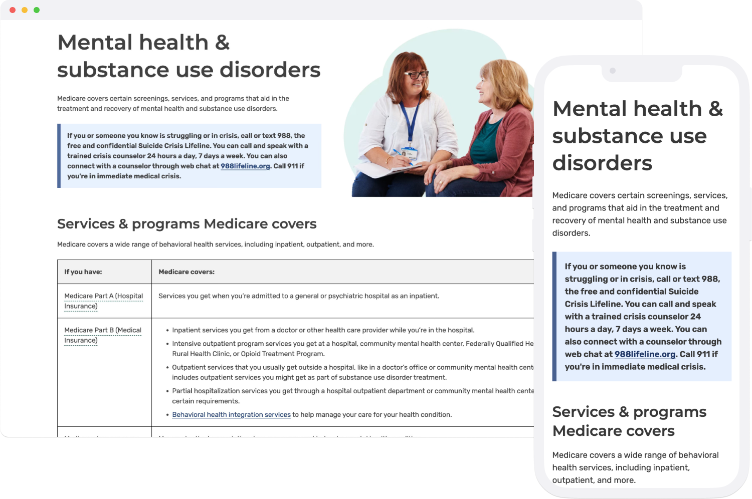
The landing page provided a prominent 988 lifeline number for people in crisis
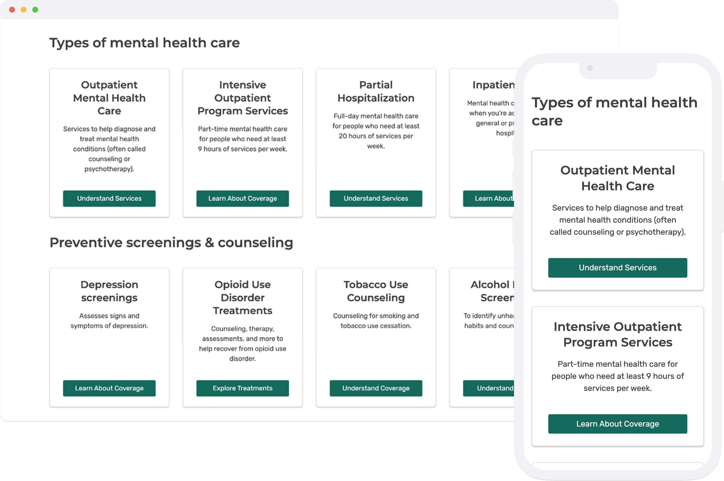
Plain language helped users compare types of care to figure out what is right for their needs
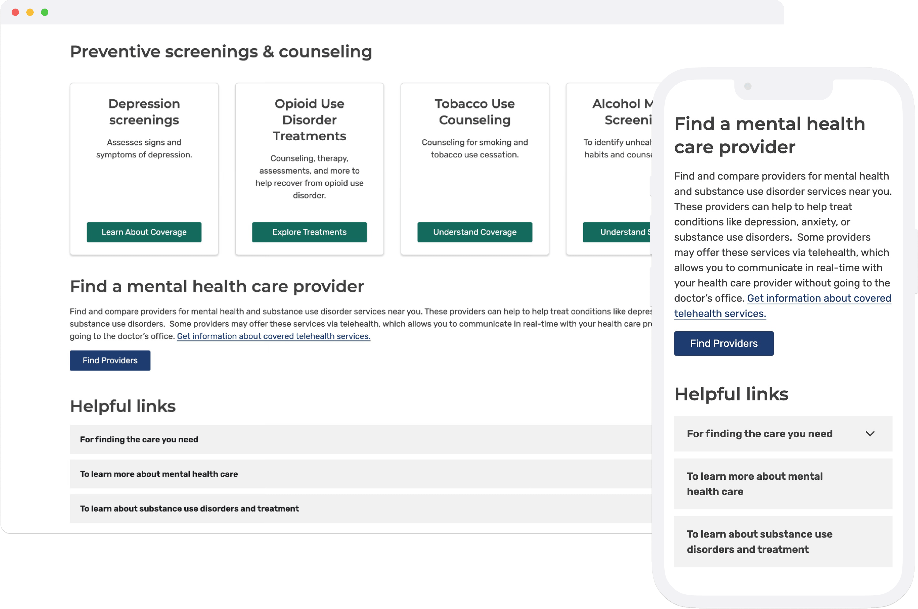
We ensured that there were no dead ends; provided a link to find a mental health provider along with helpful links
Impact
Every key metric improved: reach, engagement, and navigation of mental health content.
20.2M
Users reached at email launch
126K
Visitors to the landing page in the first 90 days
51%
Increase in visits to outpatient care page
43%
Increase in visits to depression screening page
Metrics were tracked across three 90-day periods (pre-launch, post-launch, and year-over-year) to produce a reliable read on real user behavior. 184K total visits were recorded across the landing page and its subpages.
Learnings
01
Centralized content changes behavior.
Bringing scattered information into a single hub measurably shifted how users navigated coverage. Structure matters as much as content; users couldn't engage with information they couldn't find.
02
Users wanted preventive care information — and found it.
The post-launch data told a clear story: visits to depression screening content increased 43% and outpatient care by 51%. Once users had a single entry point, they navigated directly to preventive services they hadn't been reaching before. Structure didn't just improve findability, it changed what users were able to act on.
03
Channel shapes behavior.
The email-driven mobile spike (47% of landing page visitors versus 37% sitewide) was a clear reminder that how users arrive at content affects how they move through it. Device context should inform design decisions from the start.