
Medicare.gov · Lead Designer
Americans were turning to third-party sites and call centers to understand their own Medicare coverage. Our solution impacted metrics across the board.
+7 pts
CSAT
+10 pts
Return rate
+19 pts
Search engine traffic
As Lead Designer, I owned the process end-to-end, from research through engineering handoff on a cross-functional team.
Problem
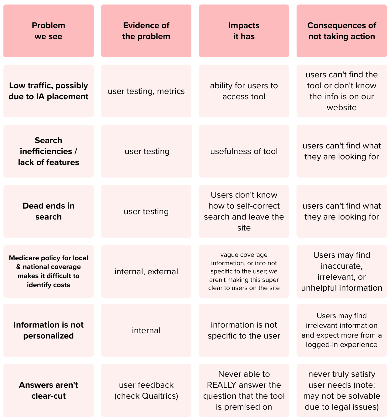
Users turned to third-party sources because Medicare.gov's coverage information was too fragmented to find or trust.
Medicare.gov gets 4M users per month, and the coverage section had grown to 170+ pages of unstructured content. People on Medicare struggled to understand what they were actually covered for, estimate costs, and find reliable answers. For people on Medicare, unclear information can mean missed coverage or unexpected costs.
The content had no consistent structure; the same information was presented differently across pages, making it hard to scan, hard to maintain, and hard for search engines to index accurately.
The problem wasn't missing content. It was that existing content couldn't be found or understood, and internal teams couldn't reliably maintain it.
How might we...
help Medicare beneficiaries quickly understand their coverage and confidently make decisions, while building a scalable content system that supports long-term growth?
Goals
Two audiences, one tool: users who needed clarity, and teams who needed a system they could maintain and scale.
User goals
Business goals
A kickoff workshop with stakeholders helped us align on problems and their effects on users
Process
Discovery reframed the problem, and a compressed timeline shaped how we solved it.
Discovery Approach
Mixed-method research identified specific pain points to solve for. I pulled from five sources to get the full picture: analytics, call center records, survey feedback, a heuristics review, and a content audit. A supporting designer helped with the heuristics review and analytics.
Key insight
Mapping top search queries against call center topics revealed strong overlap. Users weren't failing because content was missing; they were failing because it was hard to find and understand. This shifted the focus from adding content to building a better system.
An audit of call center data helped identify and group topics; when combined with analytics data, we got the full picture of user needs
One limitation worth naming: we didn't have the opportunity to conduct usability testing on the existing experience before designing the replacement. Our understanding of the old system's failures came entirely from analytics, call center data, and the content audit — not direct observation of users struggling with it.
Constraint - WIREFRAMING & TIMELINE
I led several weeks of preliminary research and handed my recommendations to the client. Leadership used that research to build internal buy-in; the CMS Design Director created initial wireframes to get executive alignment.
From there, the timeline compressed significantly and the design work moved quickly. We had two weeks to go from first wireframe to a working prototype, with a clear backlog of improvements scoped for post-launch.
Explorations
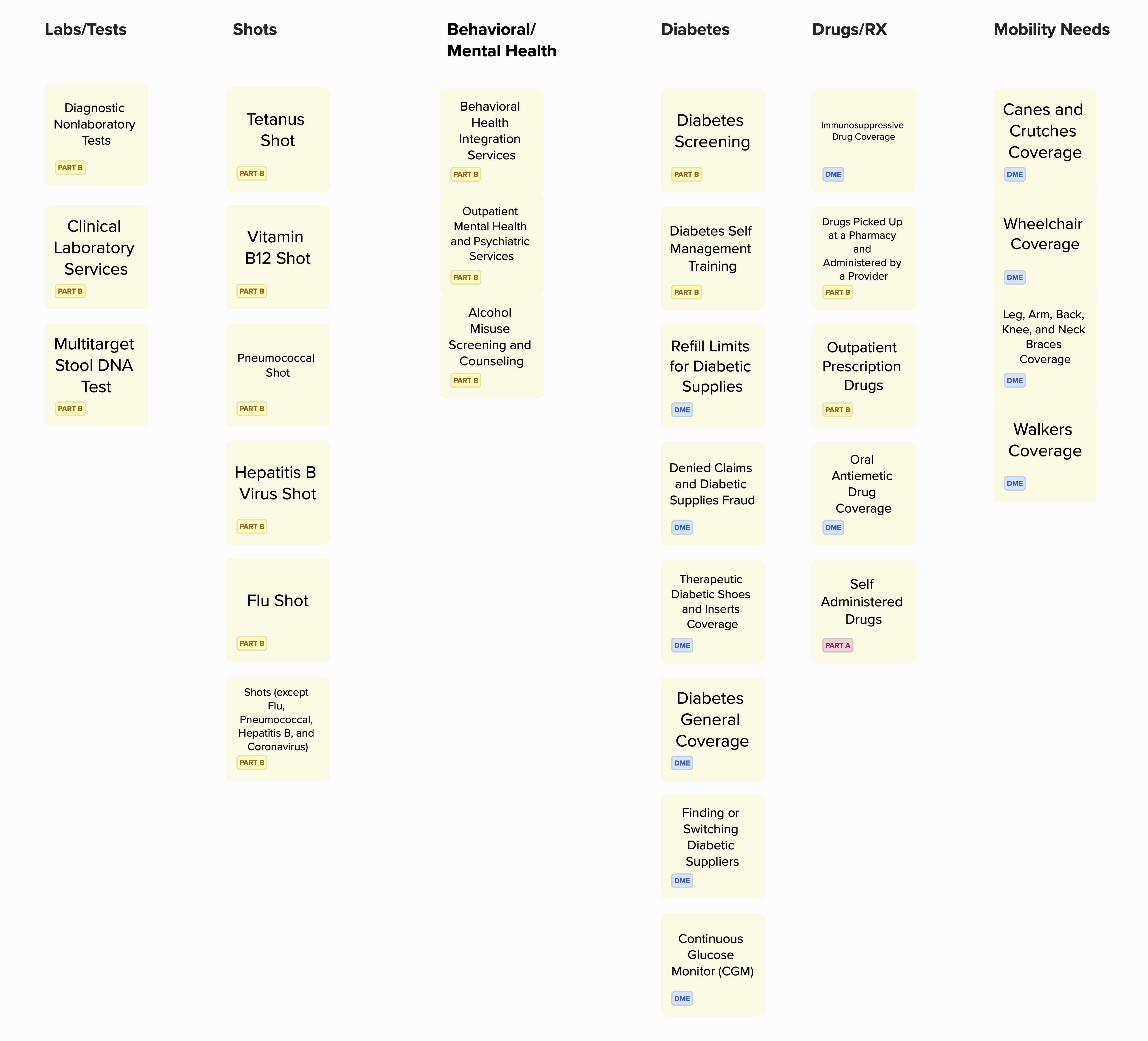
We focused on a modular content system that could scale across pages and channels, and explored multiple navigation patterns and layouts through rapid wireframing and iterative prototypes in Figma.
Technical Review
As Eng & UX teams collaborated, the engineering team ran a parallel technical review that directly shaped the solution. They evaluated structured data architecture, taxonomy, search tooling, API dependencies and custom module constraints.
User Acceptance Testing
Before finalizing our solution, a third-party firm conducted 16 in-depth 75-minute sessions with Medicare beneficiaries (independently, to avoid bias). I observed every session live, and participated in a synthesis session with the firm after the final report was delivered. The testing confirmed we were on the right track and identified necessary refinements.
Solution
A modular content system built on structured data; designed to serve users and scale for internal teams.
Modular components made pages easier to scan. It also gave content editors a scalable framework for managing 170+ pages in Drupal, while also future-proofing the content for apps, APIs, and authenticated experiences that were on the roadmap.
New landing page metrics showed a 10+ point increase in likelihood to visit
A user flow provided a visual map of the user journey through the search tool
The launch delivered:
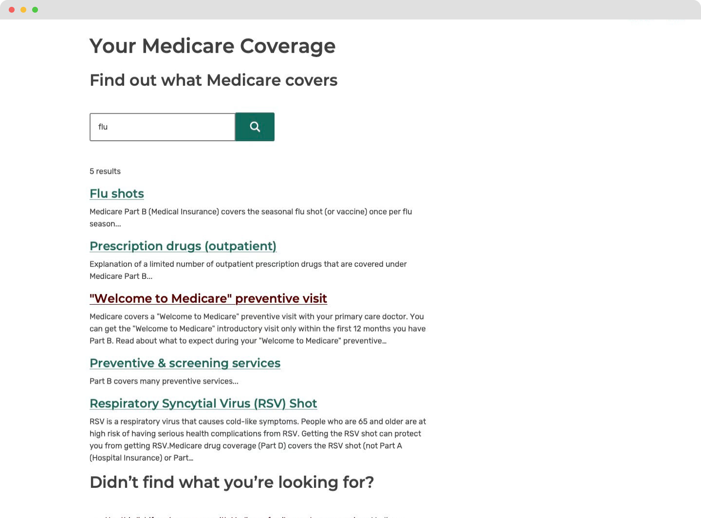
before
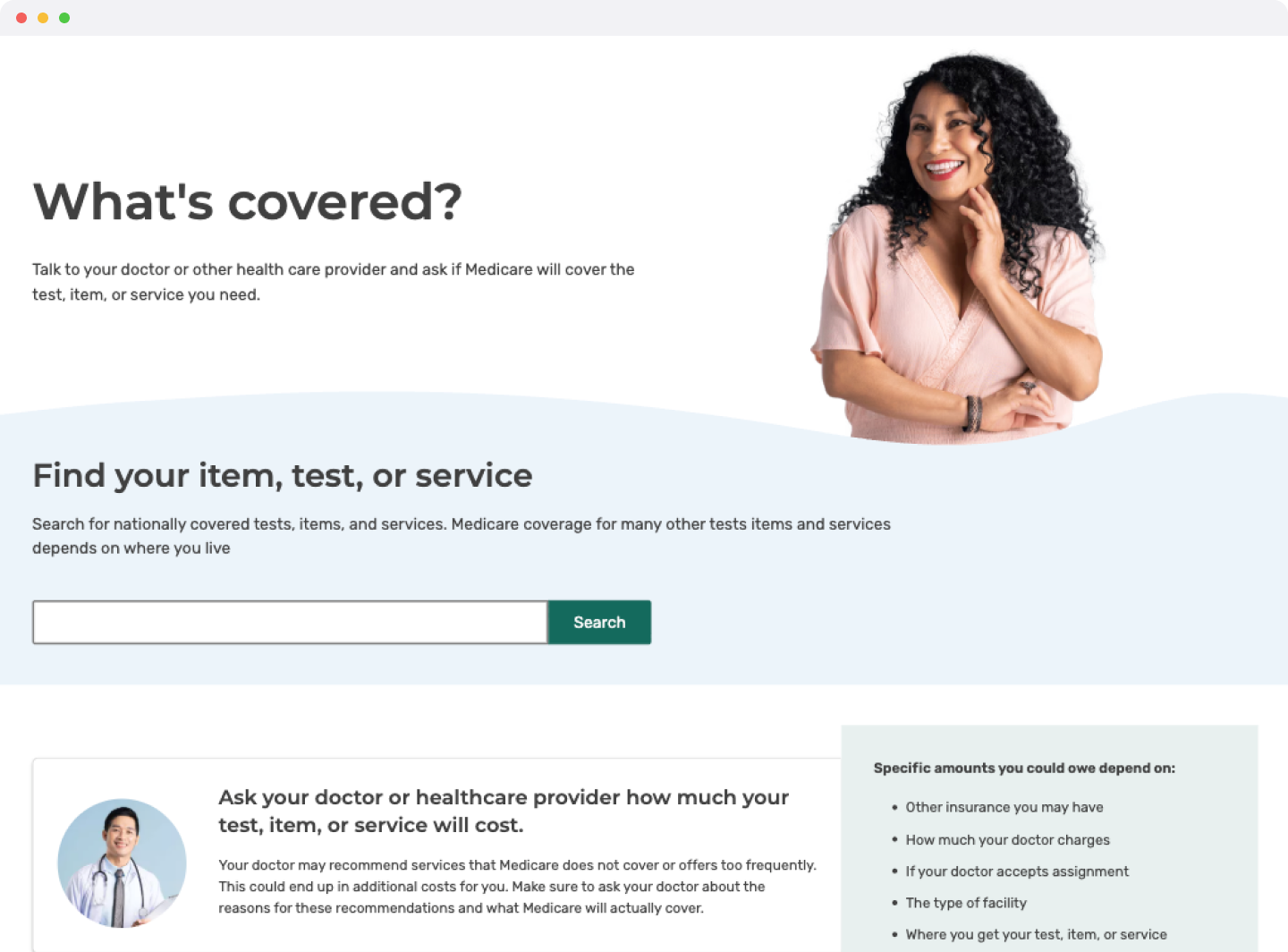
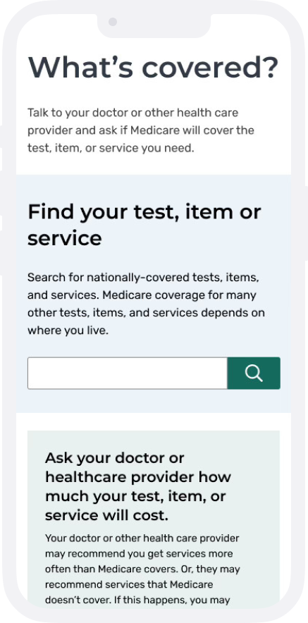
Original landing page was a basic search page that lacked clarity
after
New landing page has a friendlier layout that encourages exploration
before
Original list page included simple hyperlinks
after
New list page is more browsable and provides more context, which users expected
before
Original search results provided irrelevant results with brief snippets
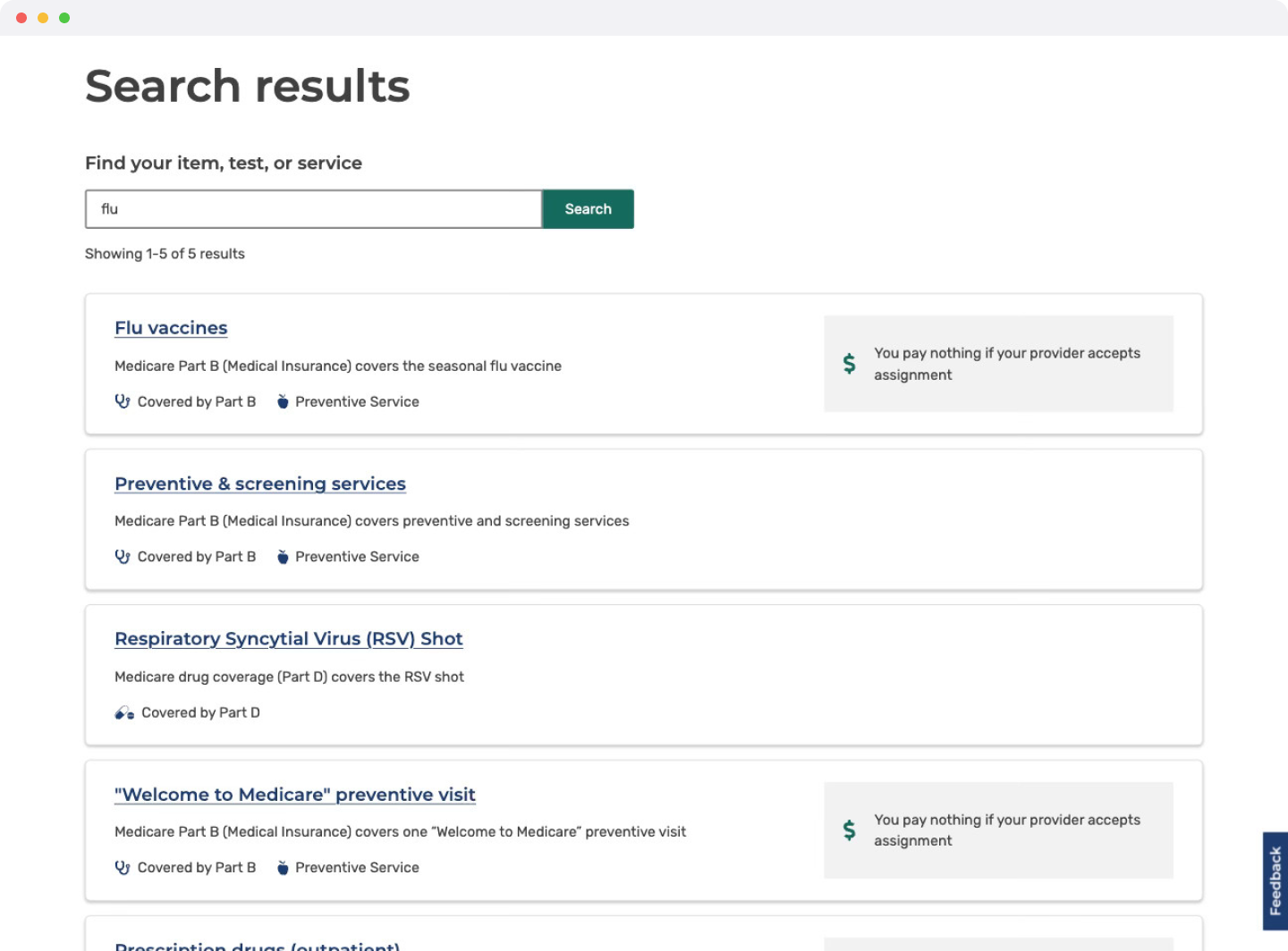
after
New search results have optimized result quality and at-a-glance information
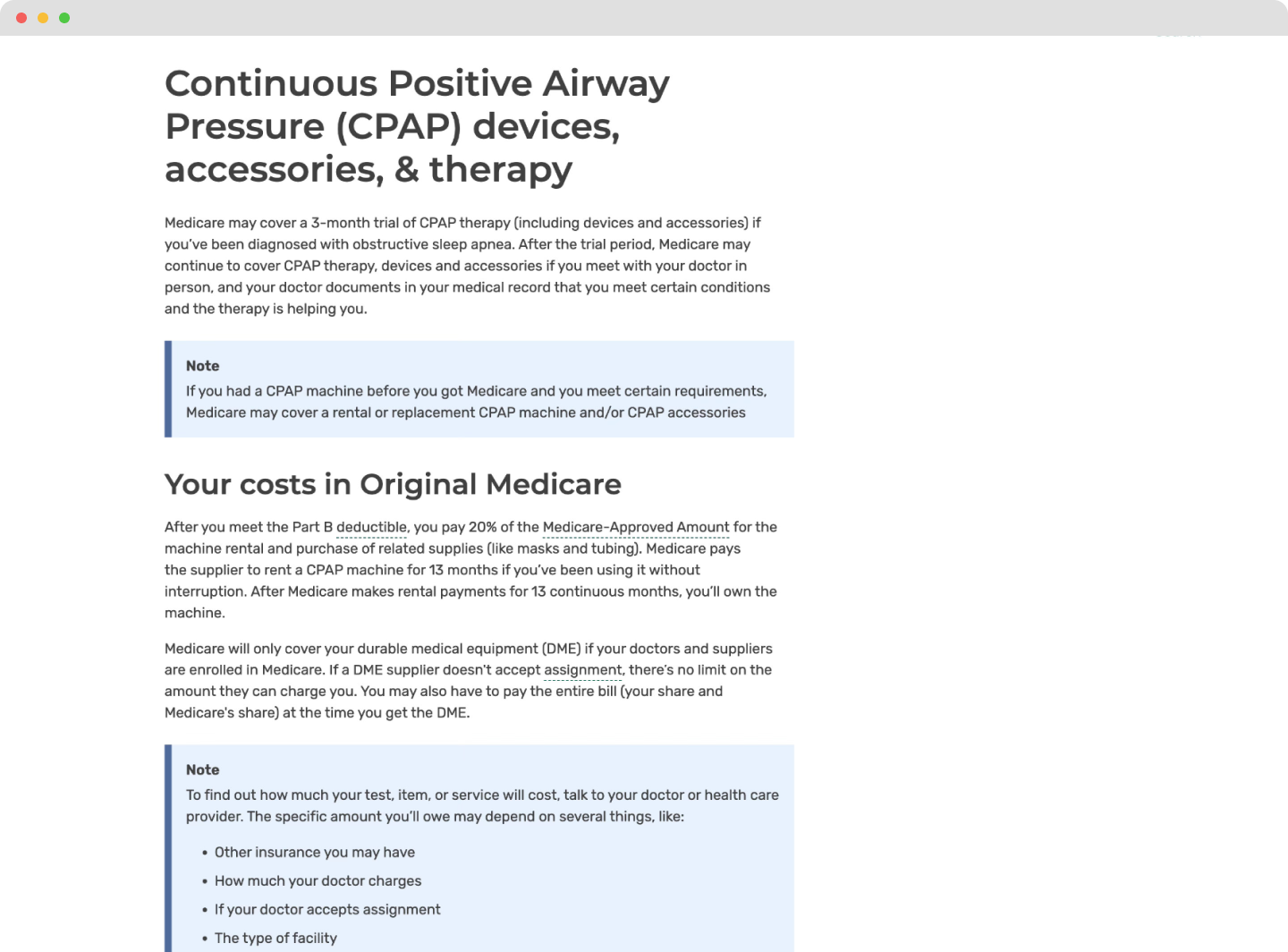
before
Original item pages were walls of text
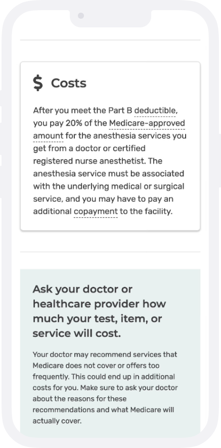
after
New item pages have easy-to-scan content
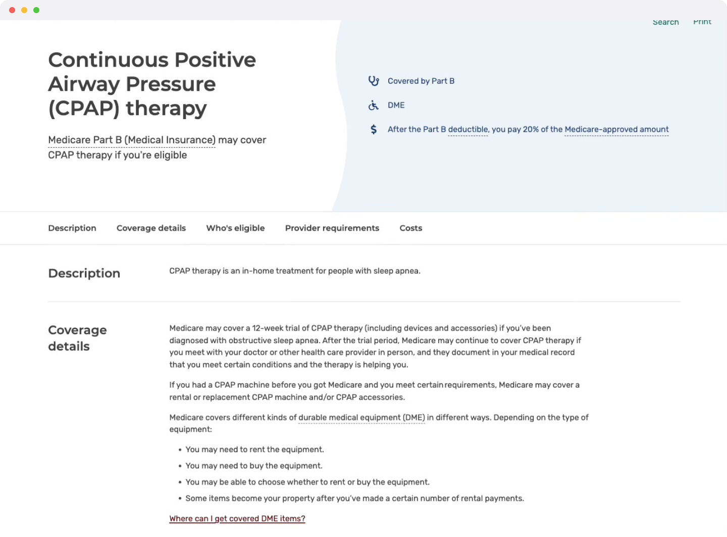
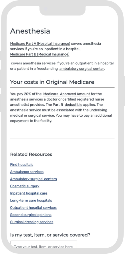
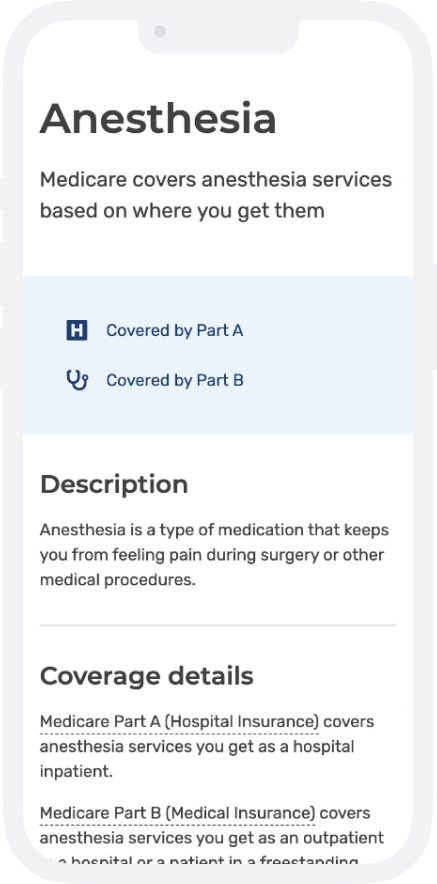
before
Original item pages were created ad-hoc and did not always make sense to users
after
New item pages use a structured setup, so disclaimers were easier to understand
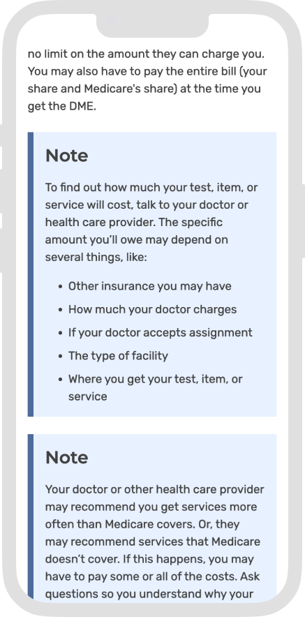
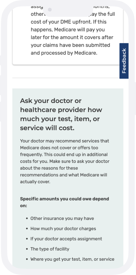
before
Original item pages were not built mobile-first
after
New item pages have sections that are mobile-friendly
Impact
Every key metric improved: satisfaction, engagement, discoverability, and trust.
2M
User sessions
in the first 90 days
72%
CSAT on desktop
↑ 7 points
+10 pts
Likelihood to return
YOY
44%
Traffic from search engines
(vs 25% sitewide)
Launching in May (ahead of Open Enrollment) gave the team a clean window of organic usage data, producing a more reliable read on real user behavior than a high-traffic period. Metrics tracked across three 90-day periods: pre-launch, post-launch, and year-over-year.
Learnings
01
Cross-functional alignment is crucial.
The most effective moments were when UX, engineering, and content were problem-solving together rather than handing off to each other. On a compressed timeline, that collaboration was what kept the solution feasible.
02
The best UX decisions serve users and the system.
The content approach didn’t just improve the experience for users; it made the content easier to maintain.
03
Mobile is the clearest next investment.
Post-launch data showed mobile CSAT at 49% versus 72% on desktop a significant gap that points directly to where the next phase of design work should focus. Closing that gap means getting closer to how people actually use Medicare.gov on their phones, something this project's timeline didn't allow.